PROJECT OVERVIEW
Big Boom Hot Sauce Co. was a design project based on creating and designing a brand name along with a 5oz label and packaging for the hot sauce. The driving point for this assignment was to create strong brand wordmark along with a brand identity system and packaging.
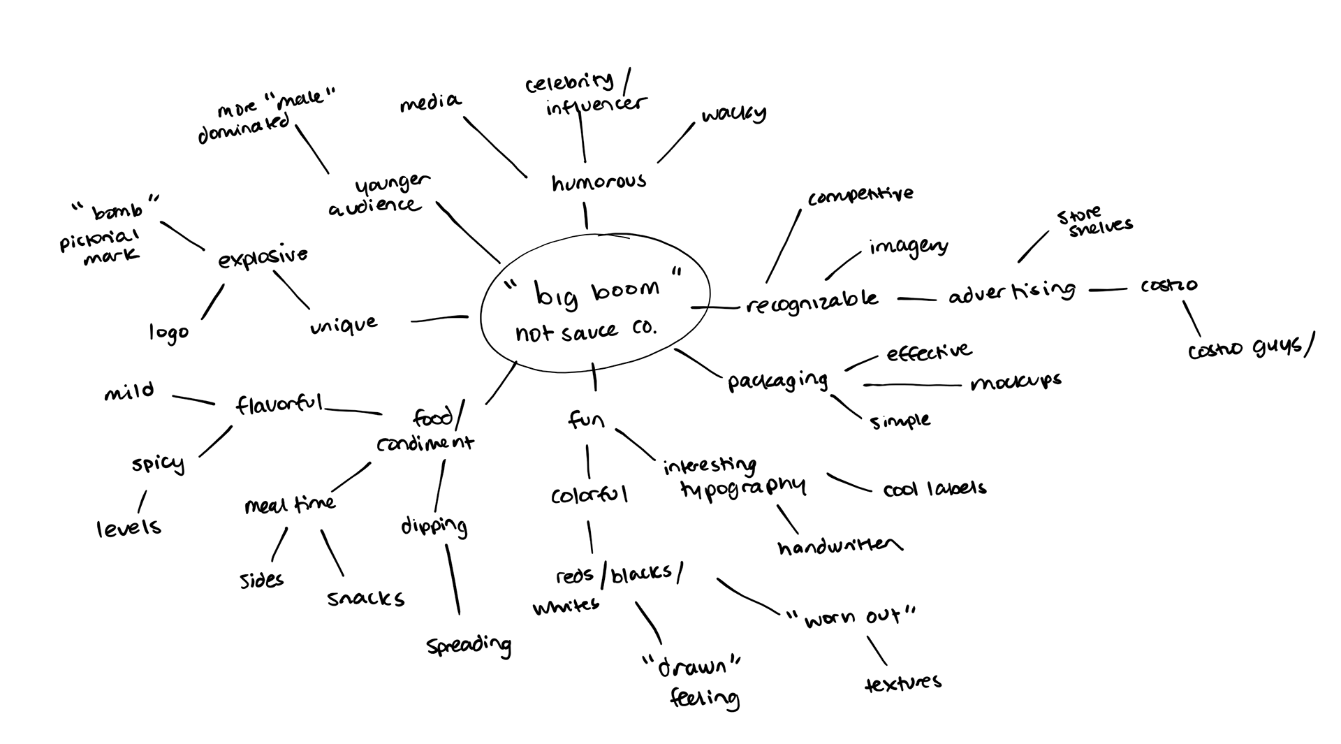
Big Boom Mind Map
PROCESS
The first step in this design process was the ideation of the brand name. Given a set of random descriptive words and nouns, the label "Big Boom" was born. Before creating any king of design or creative aspect of the project, a mind map was created in order to generate ideas.
The mind map was made to take my different ideas and turn it into a more cohesive, easy to understand territory board. The territories were created to throw more visual inspiration out in a more focused, organized manner. The territories board had a mix of ideas and outcomes, but all had similar vibes that I felt would best represent the Big Boom brand.
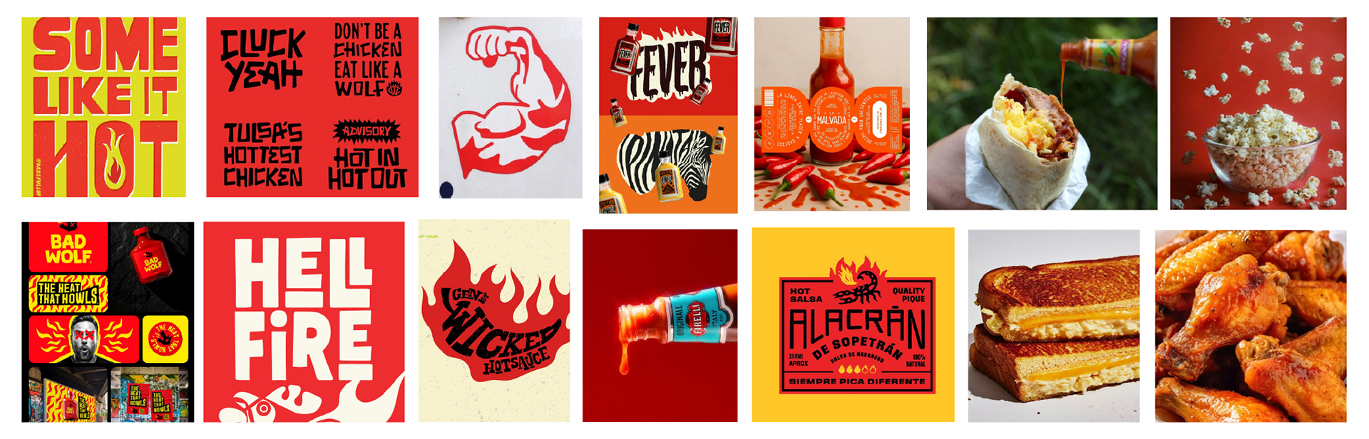
Big Boom Territories
The territories greatly helped where I wanted to take this brand wordmark and identity. However, Big Boom wouldn't be anything without an iconic wordmark to match the aesthetics. I wanted to explore different ideas, so multiple styles, compositions, and sketches were created. Out of the 10 sketches created, I chose 1 to further develop. One struggle I faced during this part of the design process was differentiating all of my logos, and more specifically creating wordmarks or emblems that could be used on a hot sauce bottle.
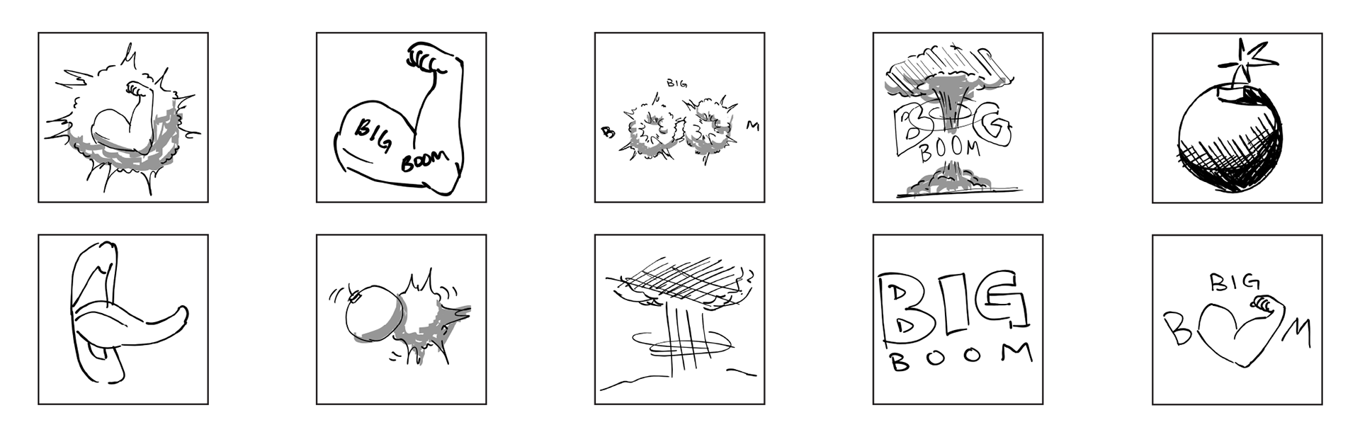
Sketches
One inspiration that I had for this project was to create a very illustrative, playful packaging. Some inspiration that I took for this project was looking at other food packaging and labels, specifically those created by famous content creators or celebrities. I wanted people to look at this brand wordmark and feel a sense of familiarity and amusement. With the sketches I made earlier, I was able to take different aspects that I liked from different sketches to create my final deliverable.

DELIVERABLES
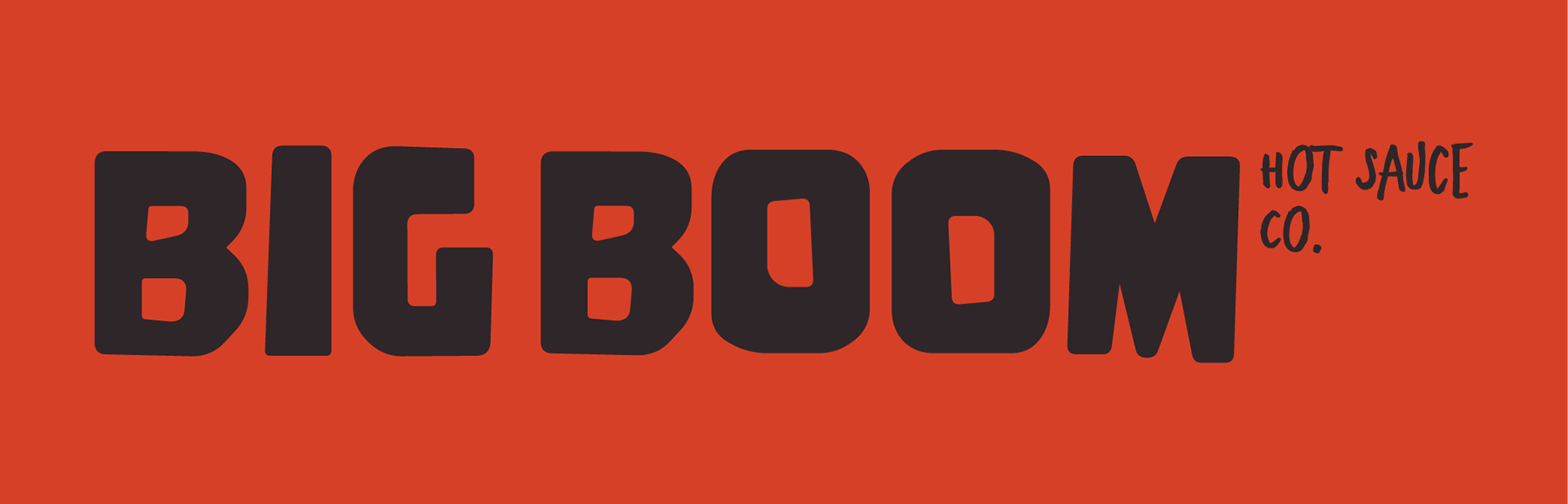
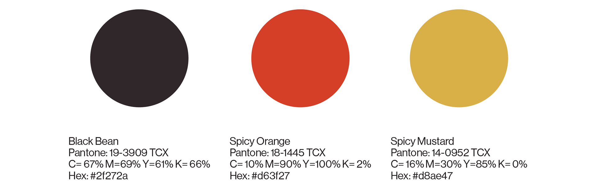
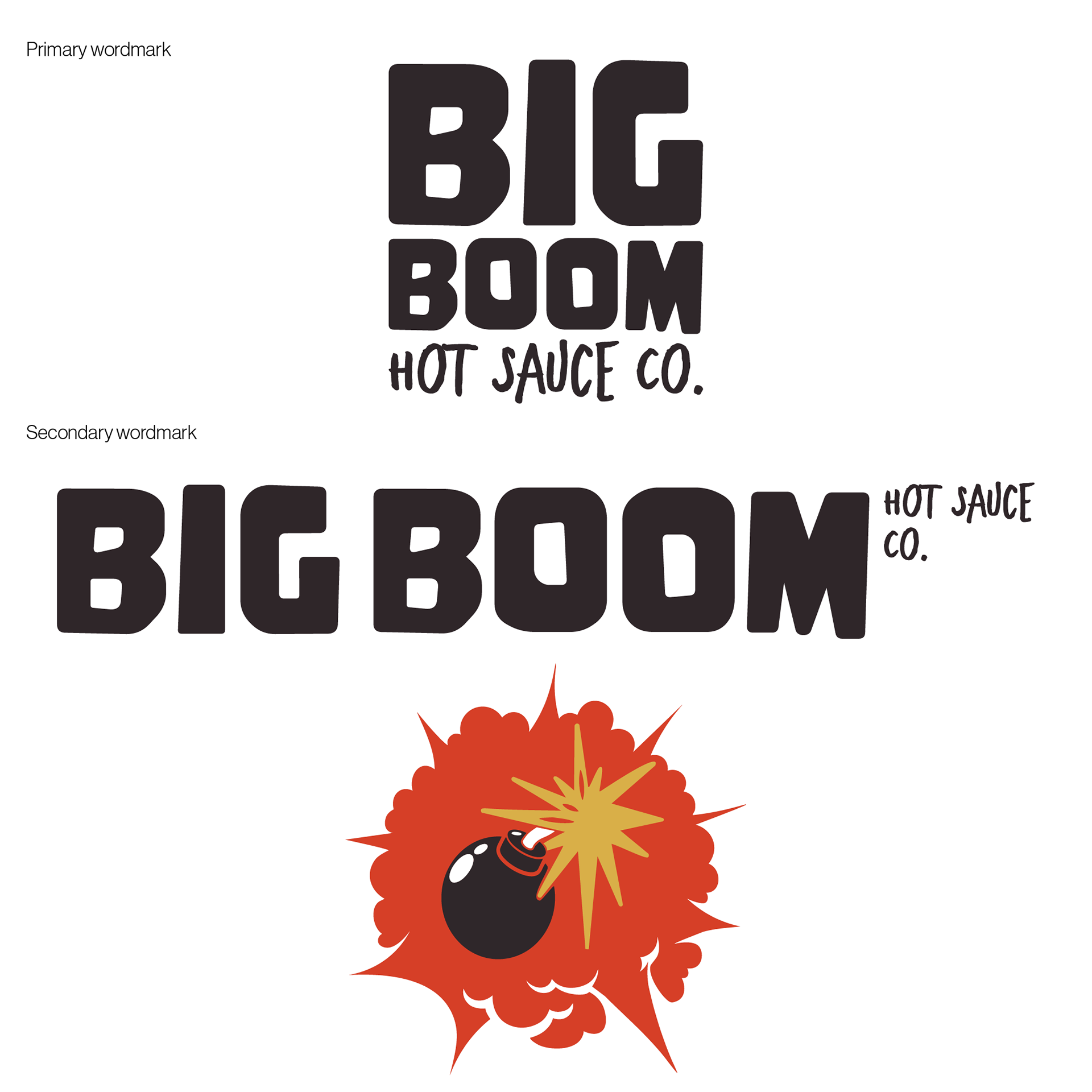
The final wordmark was created to invoke a spirited and lively vibe for the Big Boom brand. The mix of the blocky and handwritten fonts emphasize an "in your face" feel that I wanted. The colors chosen for this brand were reflected a very minimal palette. The red and yellow complemented each other well and to me gave off the feeling of similar food color palettes.
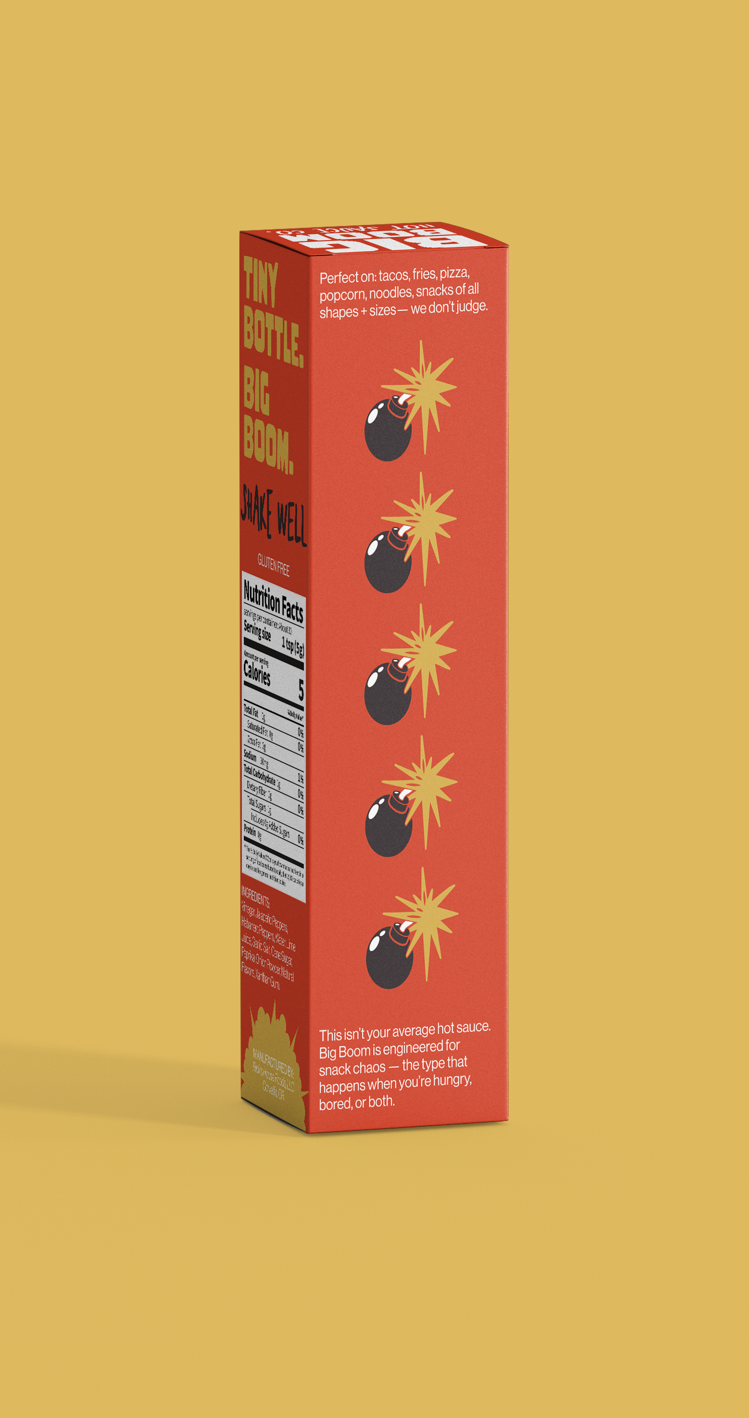
I also created physical packaging for the hot sauce bottle, which included the outer packaging and a label for the bottle. The box packaging included a nutrition label, the wordmarks, size and weight of the bottle, and captions for the product. The label for the bottle also included the size and weight of the bottle as well as specifications of the product.
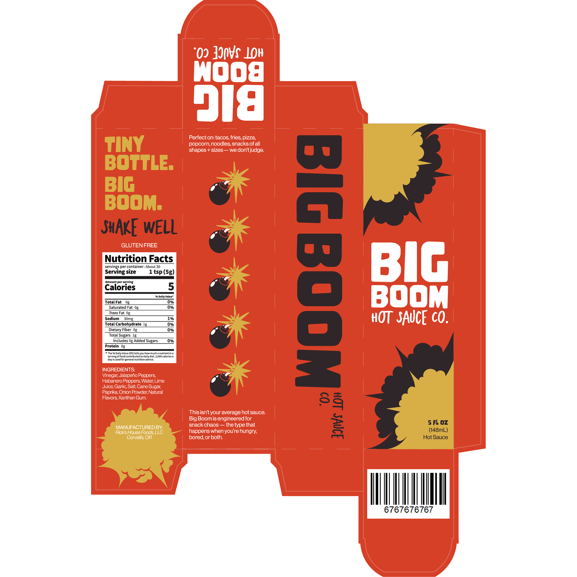
Packaging Die Line

Bottle Label
Finally, I created mockups for the packaging. This project was incredibly fun, and I feel as through throughout the design process, I think this was most successful in executing what I wanted from start to finish. The mockups below show the finished product.
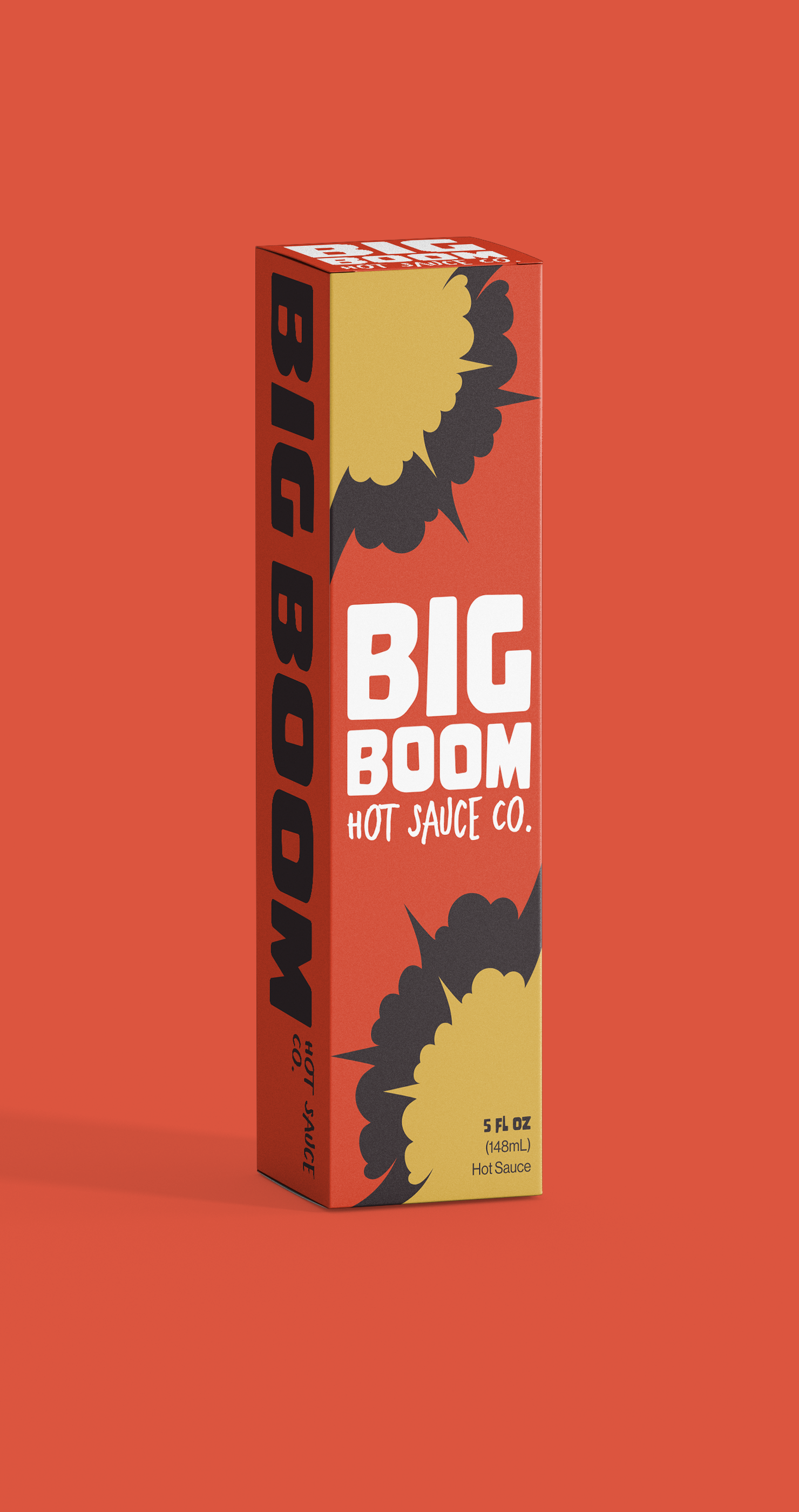
Front Packaging